
The Yin Mama
Holistic birthwork services, held by a symbol older than language.
What is The Yin Mama?
The Yin Mama offers holistic birthwork, support carried through pregnancy, birth, and the postpartum season. The brief wasn't really about a doula practice. It was about the womb as a portal: the idea that the same cycle governing birth and death also governs the moon, a plant's growth, a season turning over. That's a lot of philosophy to carry in a single mark. Most wellness brands solve it with a moon phase or a lotus and call it done. This one needed to earn its symbol rather than borrow one.
The challenge
The brief didn't read like a typical branding form. Under "words or phrases you think of when you think of your brand," the answer wasn't warmth or trust or community, it was balance, feminine/masculine, darkness/light, life/death, strength/softness. This wasn't a doula practice looking for an approachable logo. It was a request to hold opposites in one mark without resolving them. The founder built her practice around a specific conviction: that the calm or chaos of the people in the room of birth is often the deciding difference between a peaceful and a traumatic one. That's not an easy thing to communicate on a website in the few minutes a pregnant client spends deciding whether to trust a stranger with one of the most vulnerable experiences of thier life. The identity needed to make that specific philosophy, presence as the actual service, legible at a glance, while leaving room for her practice to expand credibly into yoga and community herbalism without the birthwork core getting diluted or read as a generic wellness brand.
"Where there is a woman there is magic. If there is a moon falling from her mouth, she is a woman who knows her magic, who can share or not share her powers." — Ntozake Shange, quoted in the client's own brief.
The Yin Mama serves women anywhere on the birth continuum: pre-conception, pregnancy, birth, postpartum, and grief or loss. That range mattered, this couldn't be a "new baby" brand. It needed to hold space for loss as comfortably as it holds space for birth, without ever tipping into either extreme.
The chosen concept, and why
This concept won because it didn't try to explain itself. It reads as botanical before it reads as anatomical, which meant it could sit on a business card or a packaging label without ever feeling clinical or explicit. And because it was found rather than constructed, it stayed raw in exactly the way that avoided looking like every other wellness mark. This style of drawing was chosen to express simplicity and boldness, accepting the naturality of things. No shame, no shyness, no coating.
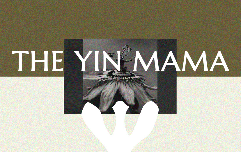
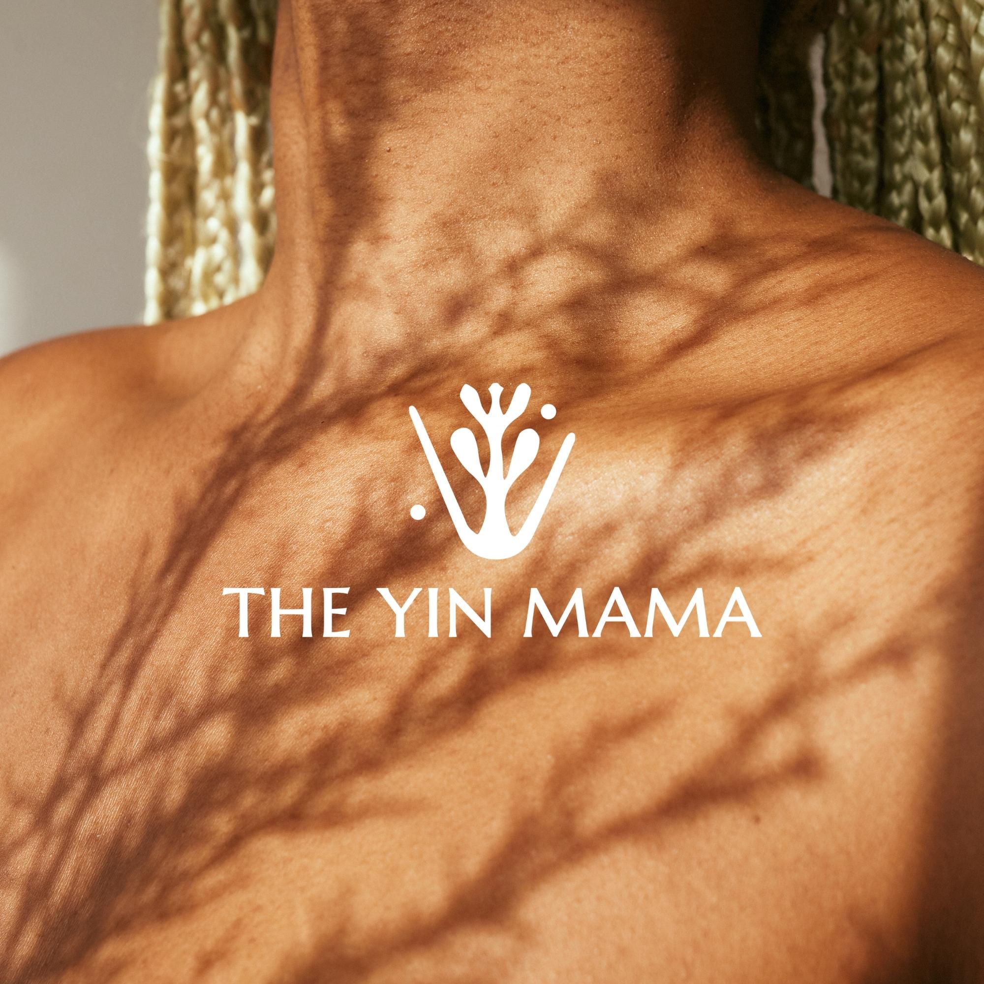
The final mark is a raw and bold abstract drawing of the reproductive system of a flower, which carries a striking resemblance to the female anatomy in human beings. It doesn't illustrate birth so much as it draws the same structure birth runs through, a form that reads as botanical first, and only reveals its second meaning once you sit with it.

The identity in the world
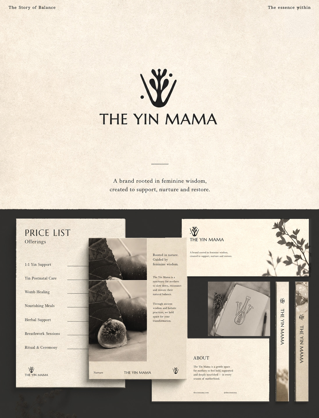
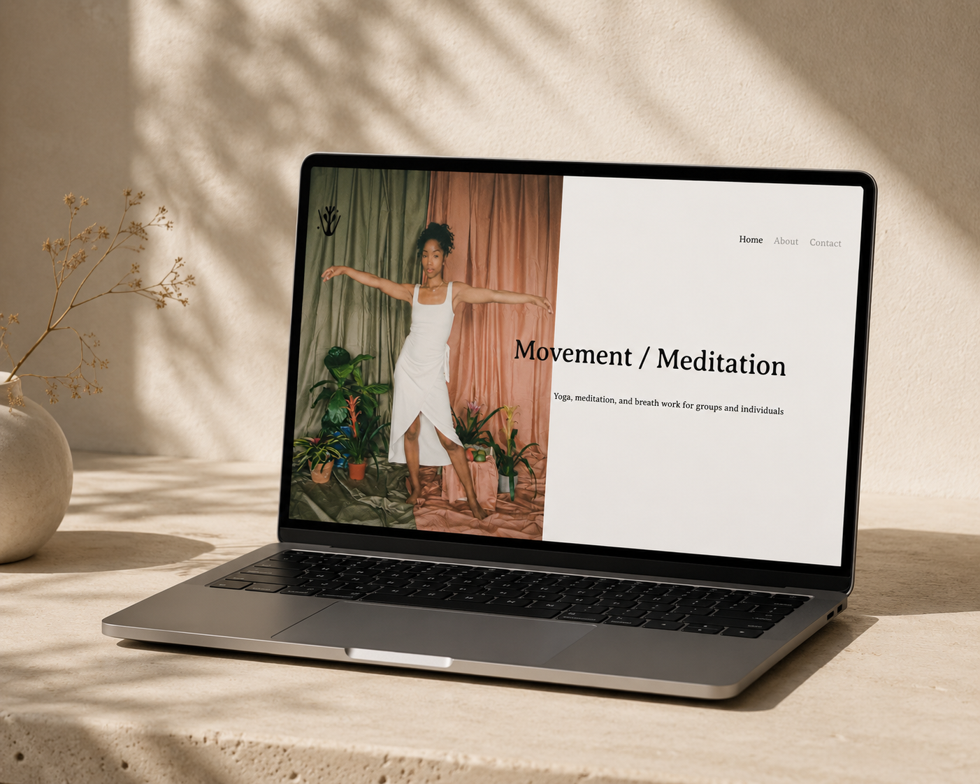
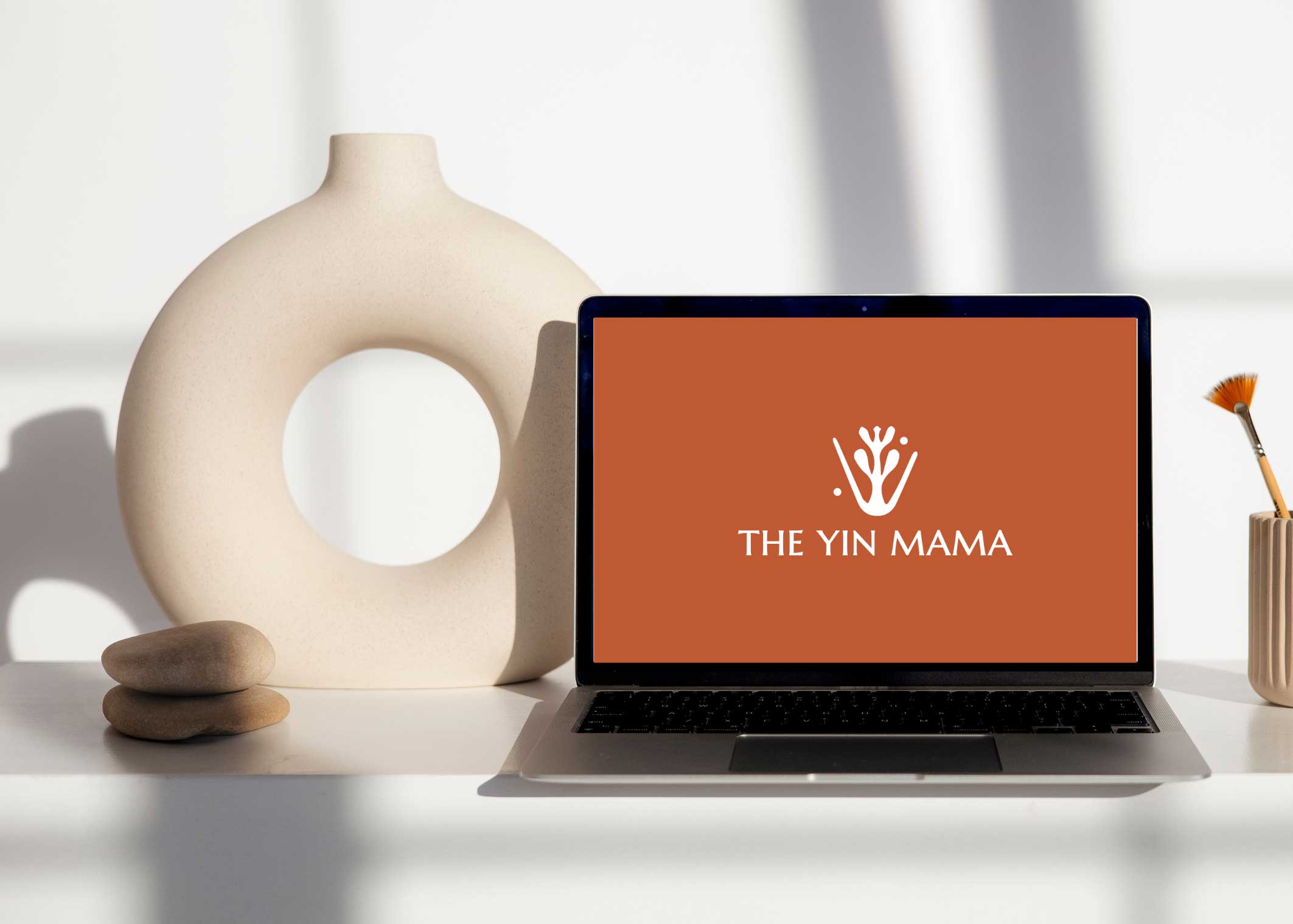
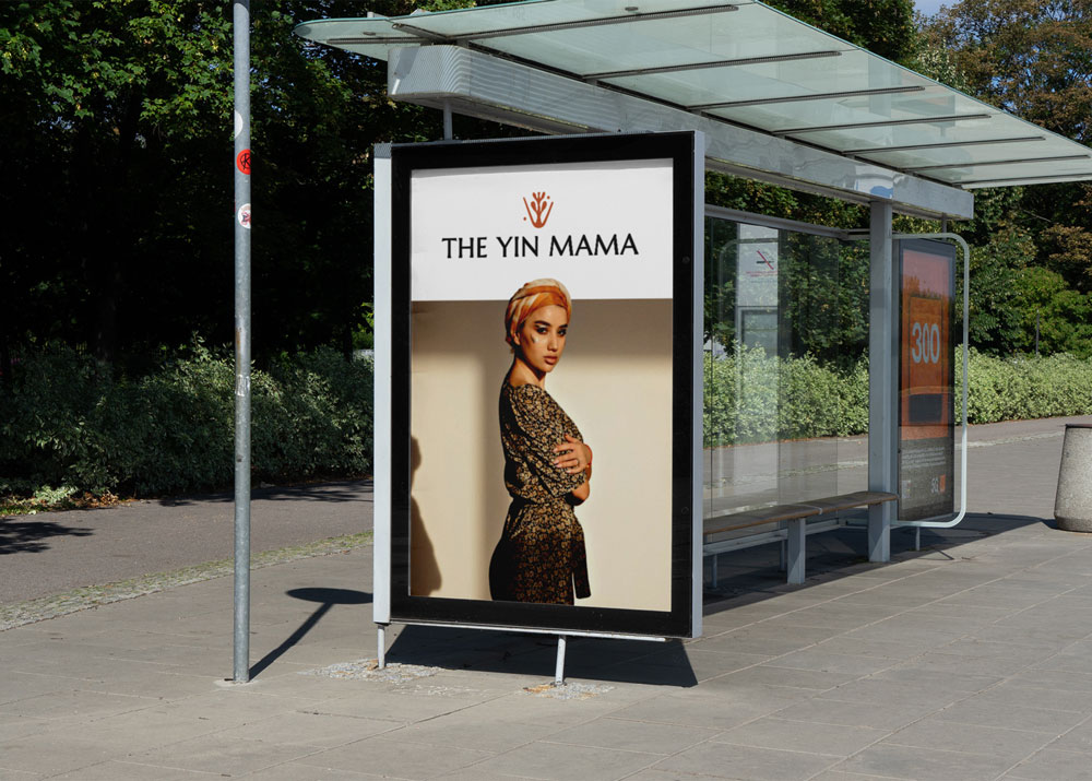
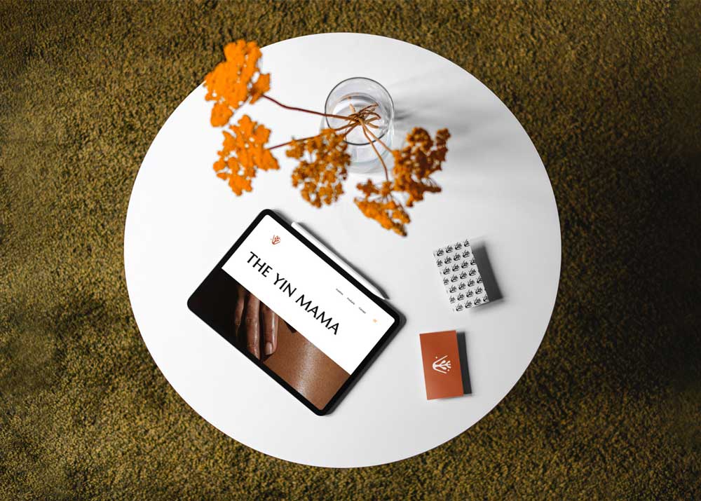
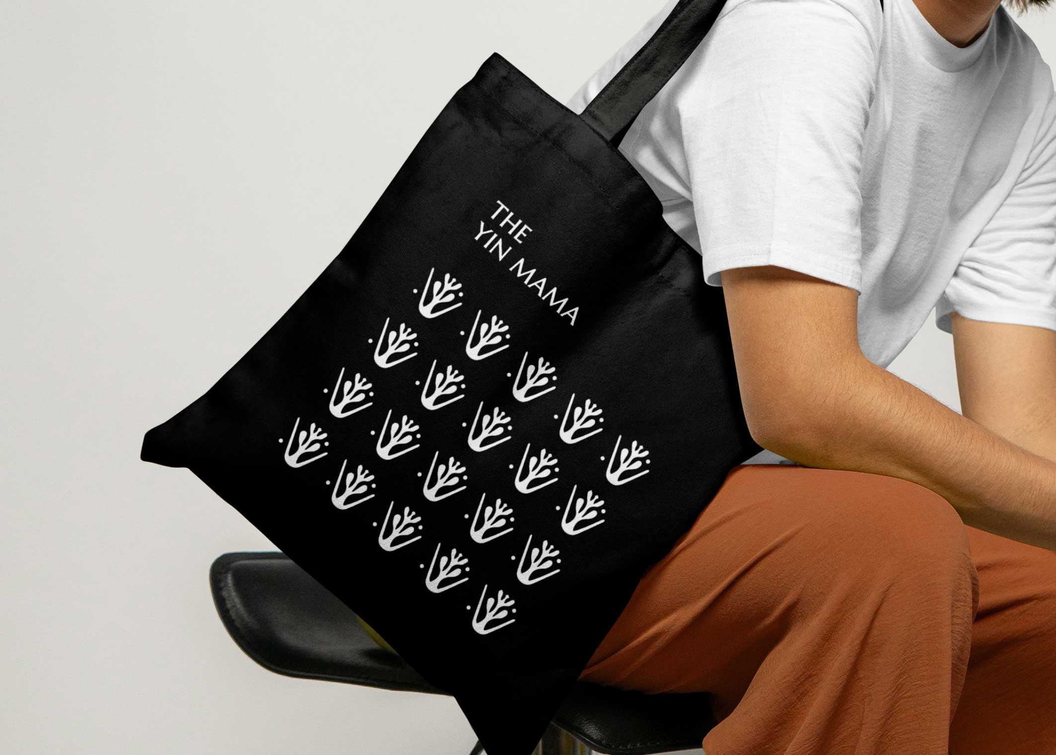
From the mark, a full system: a wordmark lockup that reads as calm as it does confident, embodied moments, and a digital presence that carries the same restraint as the mark itself.
A palette drawn from the work
Rather than start from a mood board, the palette was pulled from the identity's own applications: skin, soil, dried petals, aged glass.