
Gingerly
An Ayurvedic ritual, made visible on the shelf.
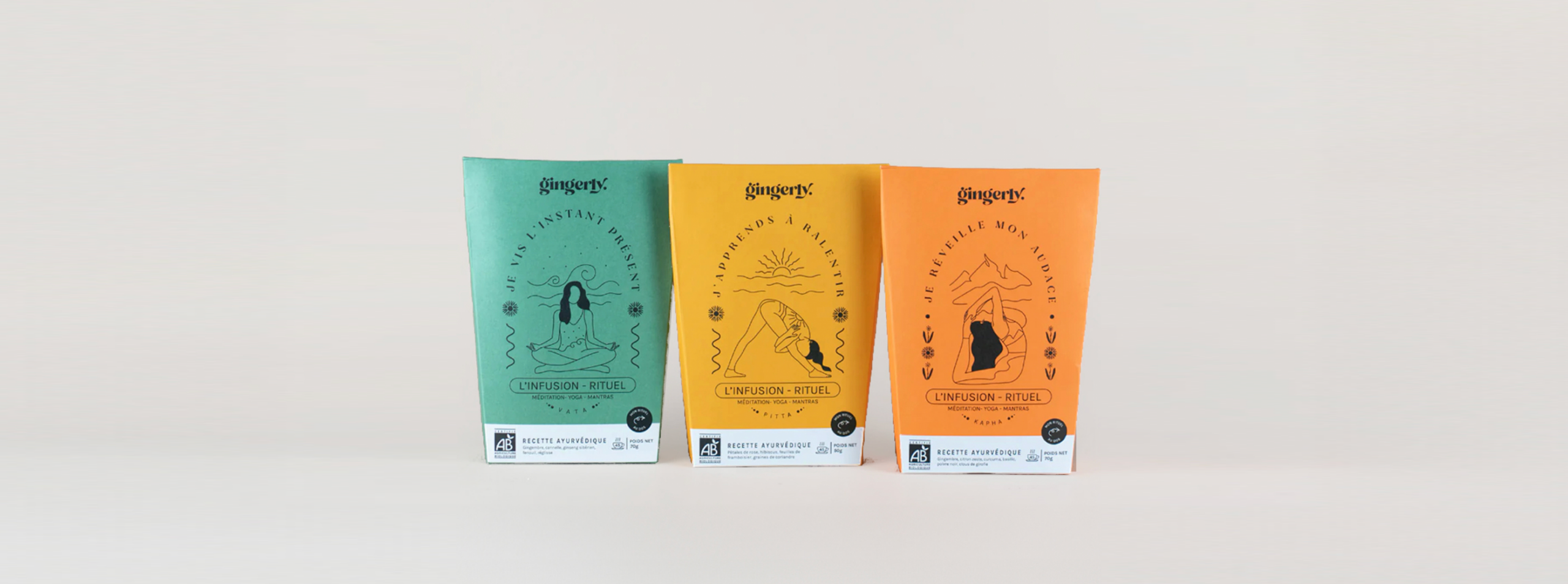
What is Gingerly?
Gingerly is a French wellness brand built on a simple idea: a cup of tea can be a ritual, not just a drink. Founded by Aurélie, who trained for years in Ayurveda and yoga, the brand creates organic, Ecocert-certified infusions rooted in Ayurvedic tradition. Each blend pairs with a guided ten-minute ritual reached through a QR code on the pack.
The recipes carried real depth. The shelf presence did not yet show it.
The challenge
The wellness tea shelf is crowded and loud. Most brands reach for the same visual shortcuts: generic botanicals, spa clichés, soft gradients that say "calm" and nothing else.
Gingerly needed packaging that could do harder work. It had to carry a genuinely layered concept, Ayurvedic doshas, emotional intentions, a digital ritual, without confusing a customer holding the box for four seconds. And it had to feel premium enough for the brand's price point and press ambitions, while staying warm and human, because the founder herself is the heart of the brand.
The illustration system
The answer was a hand-drawn illustration system rather than a single decorative motif. Each dosha received its own illustrated world, drawn from the plants and elements that define it in Ayurvedic tradition.
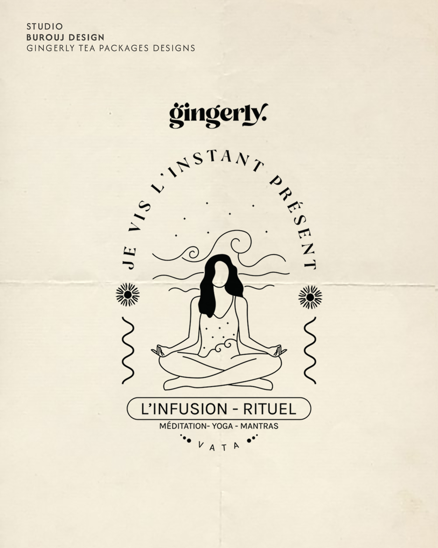
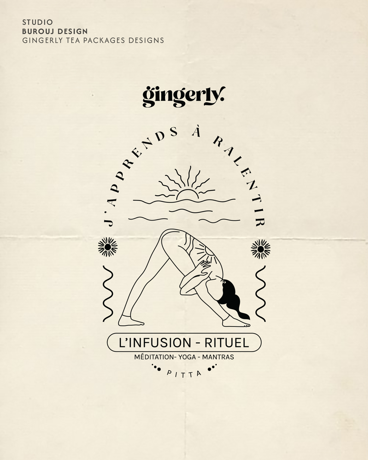
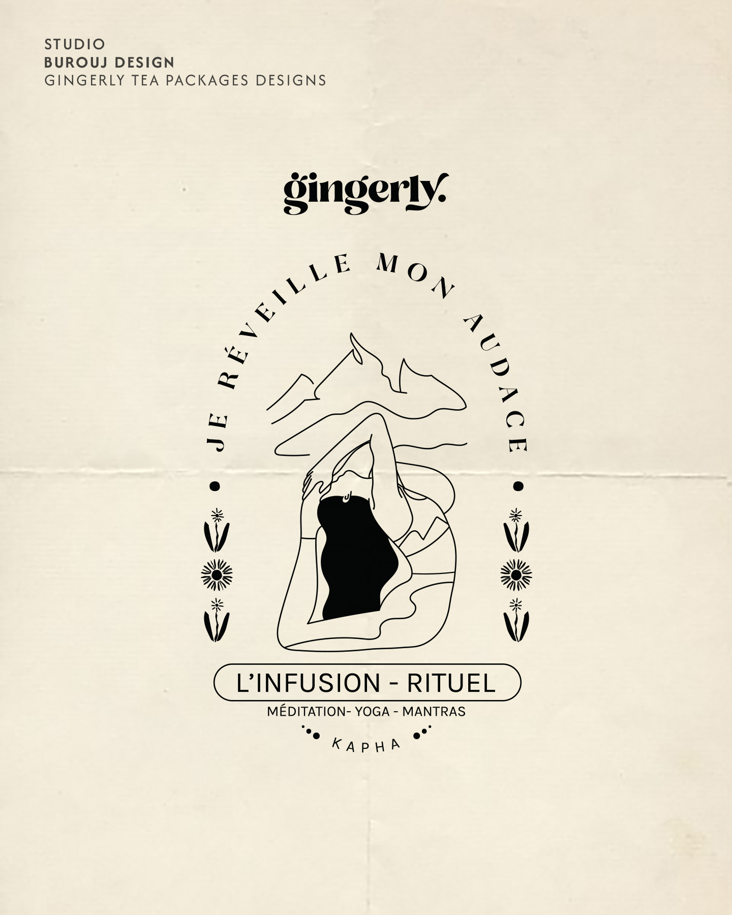
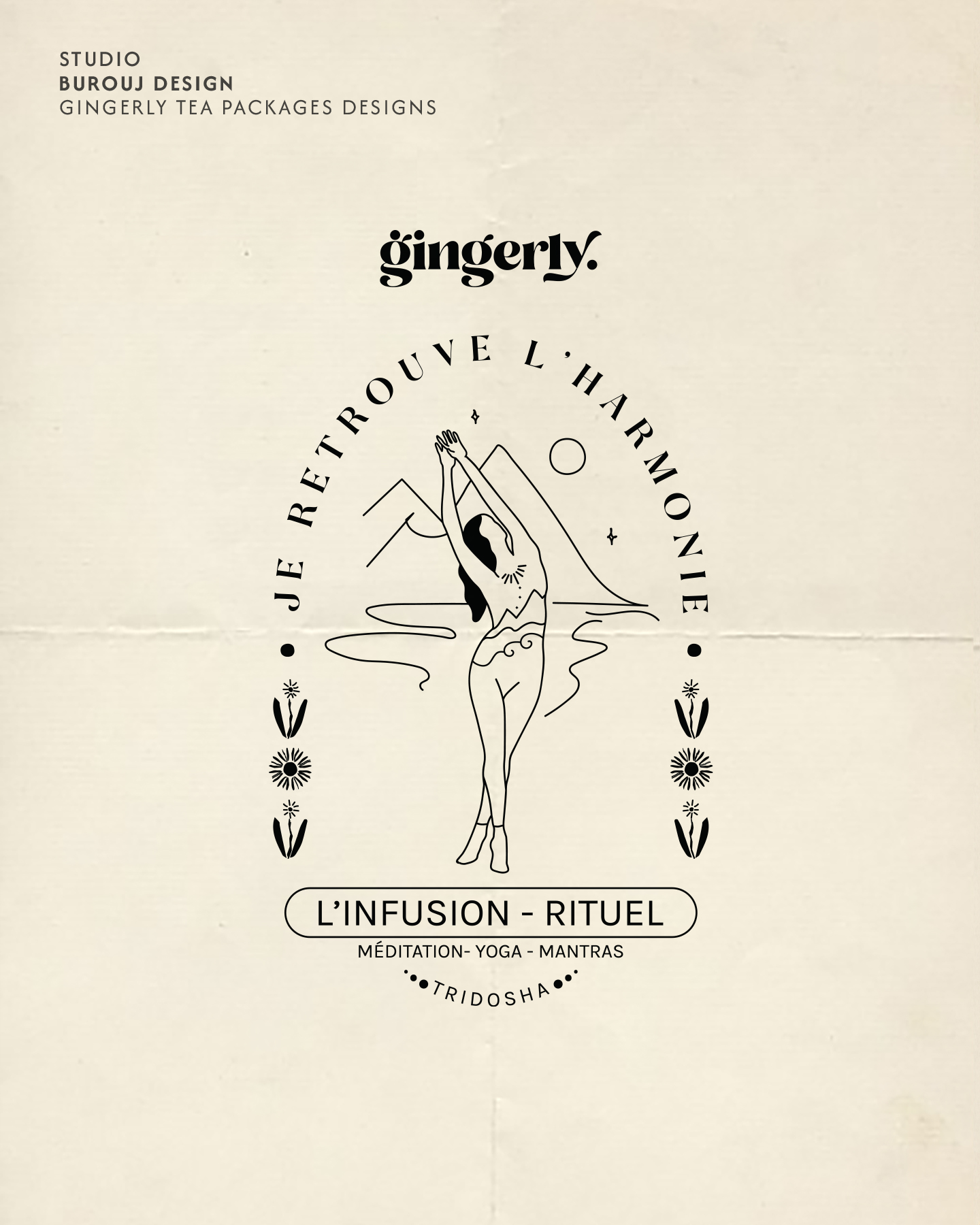
Hand illustration was a strategic choice, not a stylistic one. Ayurveda is an ancestral, human practice; machine-perfect vector art would have contradicted the brand's entire premise. The organic line quality signals what the product is before a single word is read.
The packaging in the world
The illustrations extend across the full range, giving each blend its own identity while the family stays unmistakably whole on the shelf.


After launch
Gingerly is now stocked in more than 150 boutiques across France, with press features in titles including ELLE Green and Psychologies. The packaging holds its own in premium retail while staying true to the founder's practice.
Building a product people can feel before they taste it?