
Ardh أرض
Rooted in tradition. Served with soul.

What is Ardh?
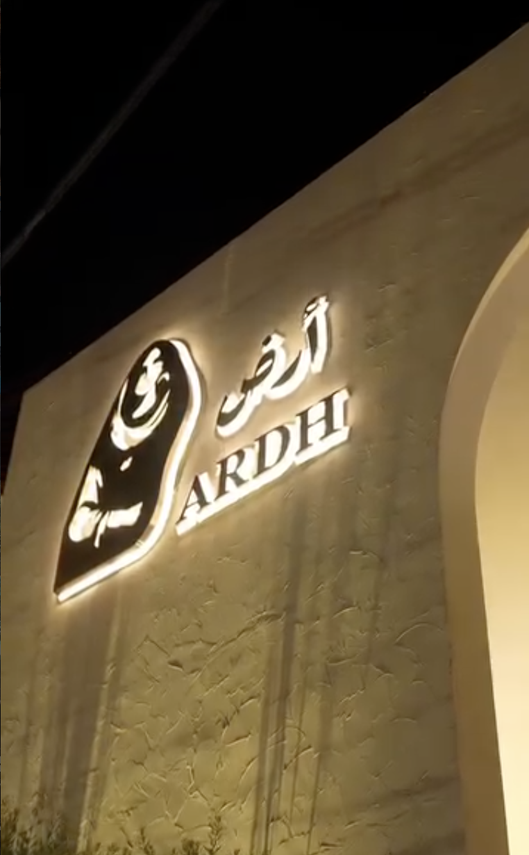
Ardh means earth, or land, in Arabic: a feminine word, tied to nourishment and creation. The restaurant is a tribute to rural Iraqi heritage, warmth, simplicity, and authenticity, carried into a contemporary dining room. Its architecture draws on traditional Islamic and Iraqi forms: geometric ornament, natural materials, hand-carved detail, earthy tones.
Before a single mark was drawn, the building had already made its argument.
The challenge
Most identity projects start with a blank page. This one started with a finished building. Co-eco Studio (an architecture practice run by colleagues from university) had already shaped Ardh's physical space. My task wasn't to invent a personality. It was to listen closely to one that already existed in brick and plaster, and carry it forward into two dimensions: onto paper, packaging, a business card, a plate without contradicting a single beam.
Beyond establishing Ardh as a premium dining destination from zero, the identity needed to carry an ongoing content strategy, not just a one-time launch. Ardh's social presence leans heavily on cultural moments: Ramadan and Eid hospitality, Iraq's national football team, family gatherings under the restaurant's own trees. The brand needed a visual system elastic enough to show up authentically in all of those contexts while still reading, in every single post, as the same considered, architecturally-rooted space, so that day-to-day content builds the same premium positioning the identity was built to establish in the first place.
Exploring the mark
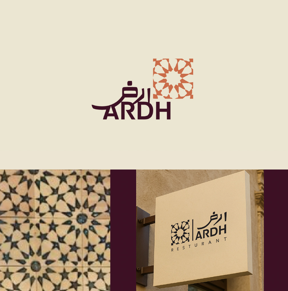
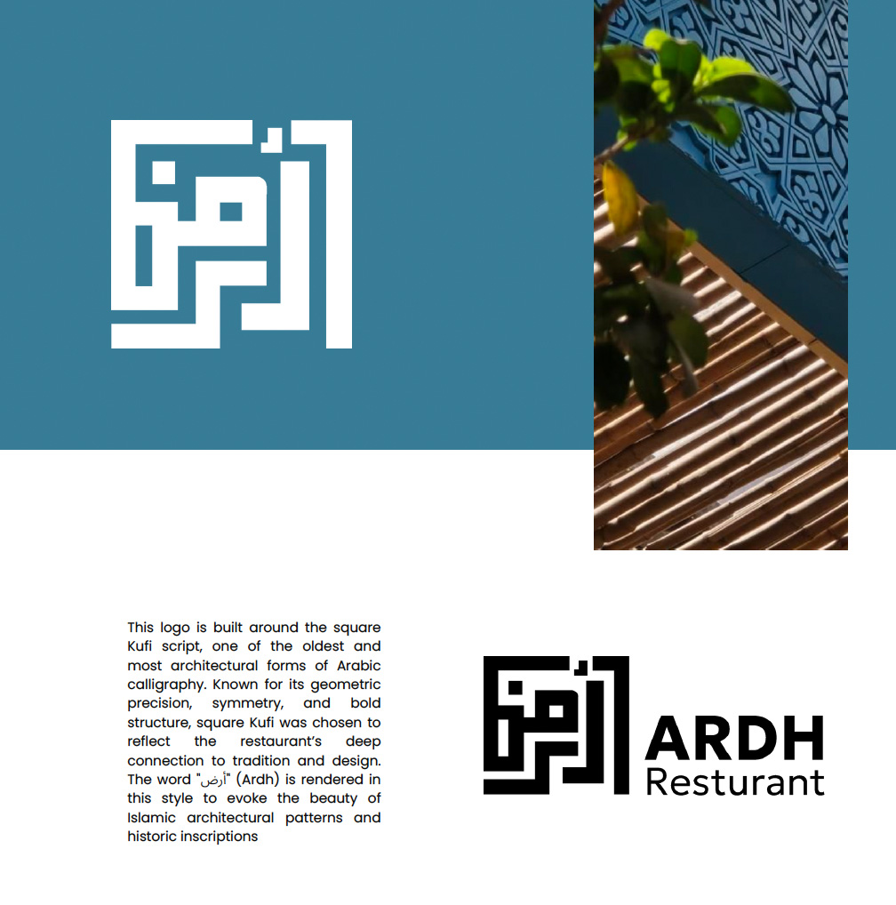
Three directions were explored before one was chosen. Each one took the architecture's language seriously, the question was which translation would carry the most of Ardh's story forward. Ardh wasn't an existing business refreshing its image, it was a brand-new restaurant that had to earn recognition from zero, in a category too often flattened into "Middle Eastern food." The real challenge wasn't just visual, it was positioning: Ardh needed to signal immediately that it was a considered dining destination rooted in Iraqi heritage, not another casual food spot, the kind of place that attracts diners actively seeking an authentic, elevated experience, not just anyone walking past. The identity had to do the work of differentiation before a single guest tasted a dish.
The concept won because it's specific to Ardh's own authentic heritage, not generic Arabic motifs, and reads as a story on sight, no calligraphy literacy needed. Paired with Arabic and English, it held up in both languages, and extended cleanly into packaging, menus, and cards, delivering the "considered destination" positioning the brief called for..
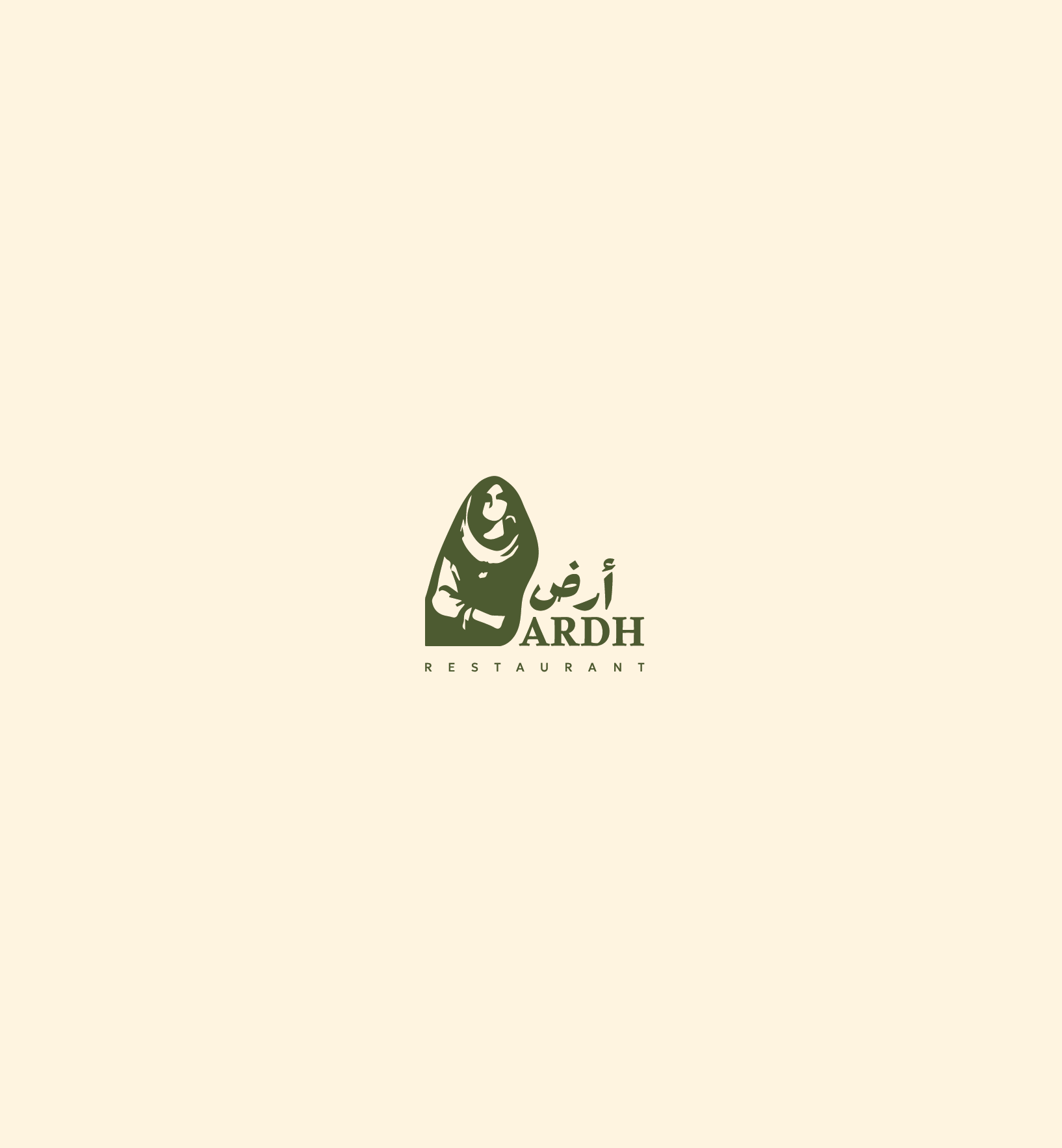
The woman farmer, rendered in the Baghdadi art style, paired with the word أرض and its English counterpart: won because it was the direction that made the name Ardh legible as a story rather than a label. Ardh means earth: a feminine word tied to nourishment and creation. A human figure who nurtures the land does more narrative work than any pattern or script alone, and it reads instantly in any context..

The identity in the world
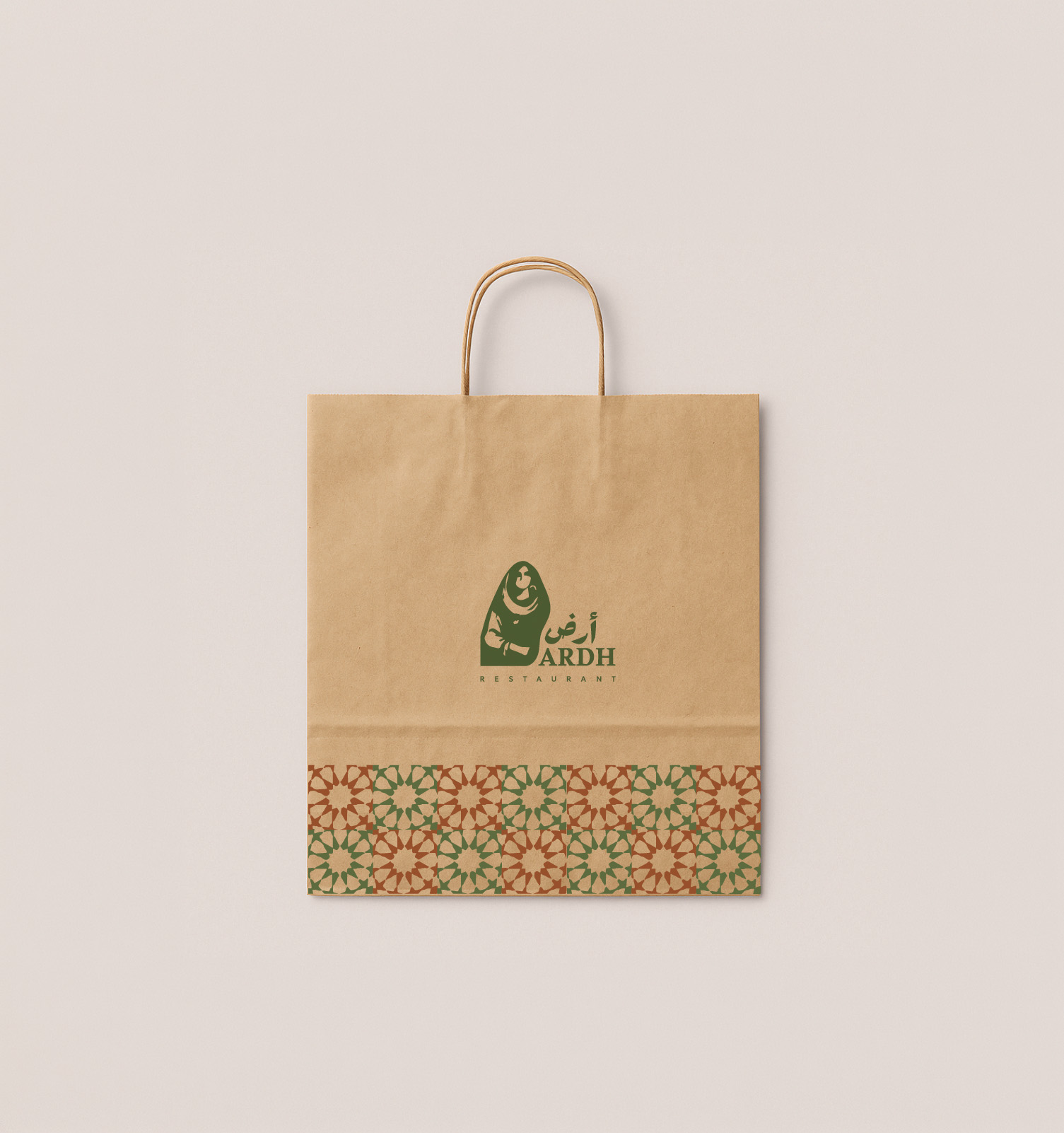
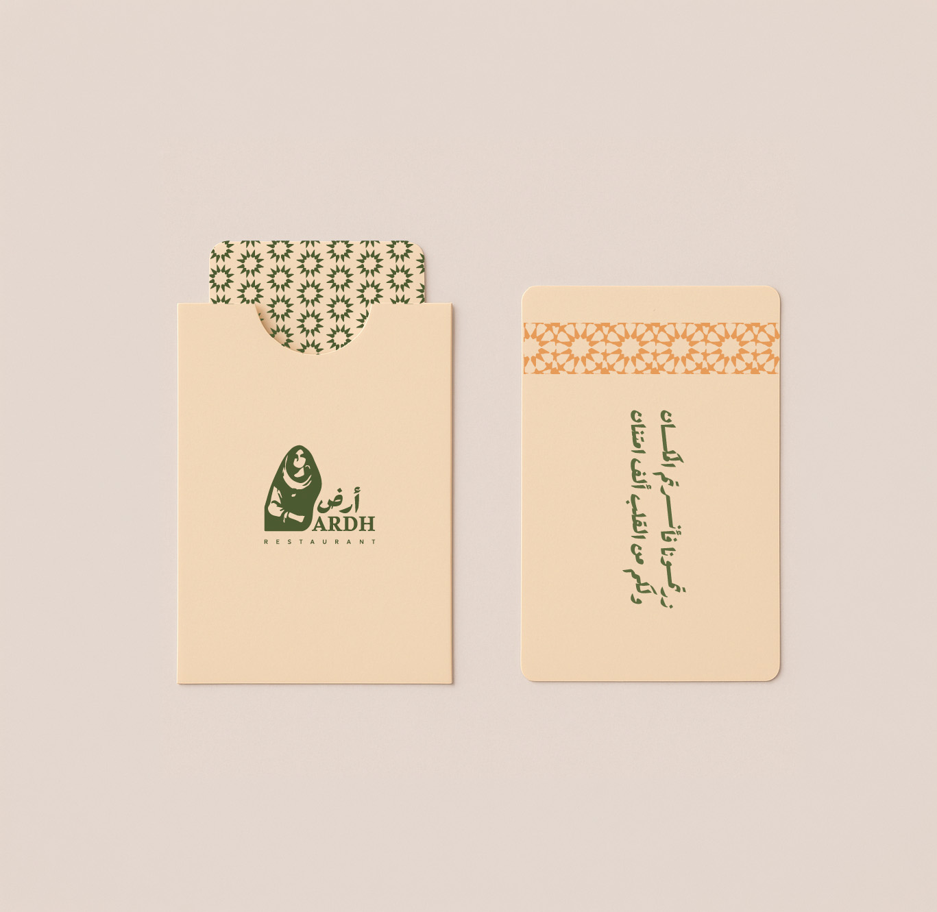
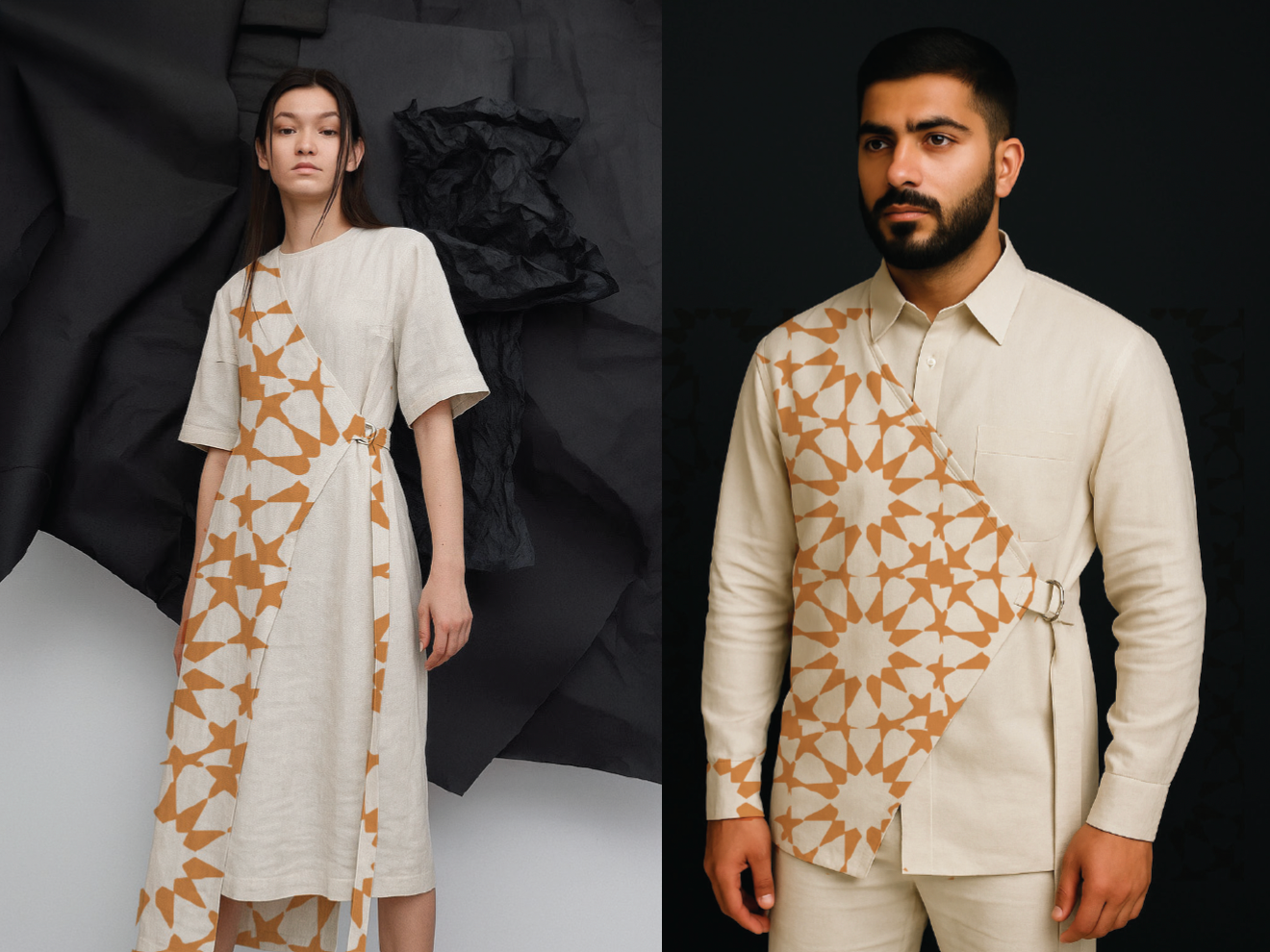
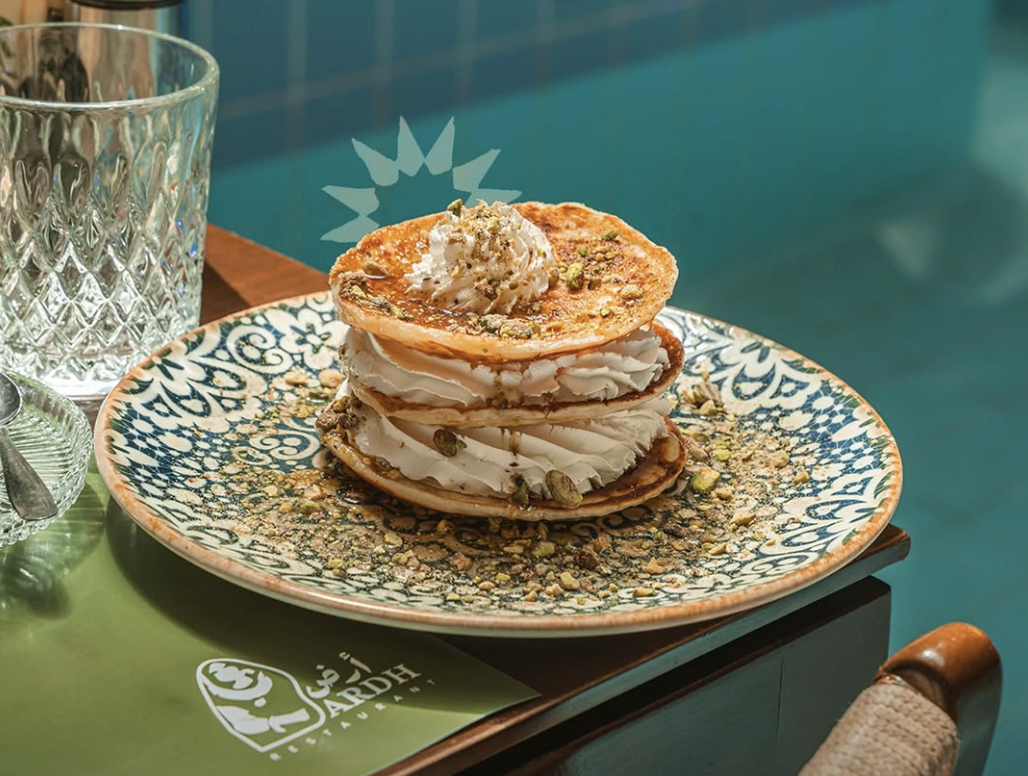
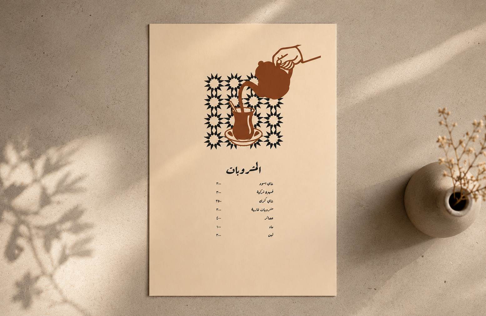
From the mark, and using the ornament element from concept 1 a full system was built. Packaging that survives being handled, a typography pairing bilingual by necessity rather than afterthought, and photography guidelines that keep every touchpoint honest to the region.What Ardh has now isn't a restaurant with a nice logo. It's one narrative, told in two mediums, that a guest can feel before they've read a word of the menu.
A palette pulled from place
Every color in the system was drawn from the land the restaurant is named for: soil, grain, sky, water. Not from a mood board.
Building something rooted in its own story?