
Palazzo D'Oro
Brand concept / Art direction study.
What is Palazzo D'Oro?
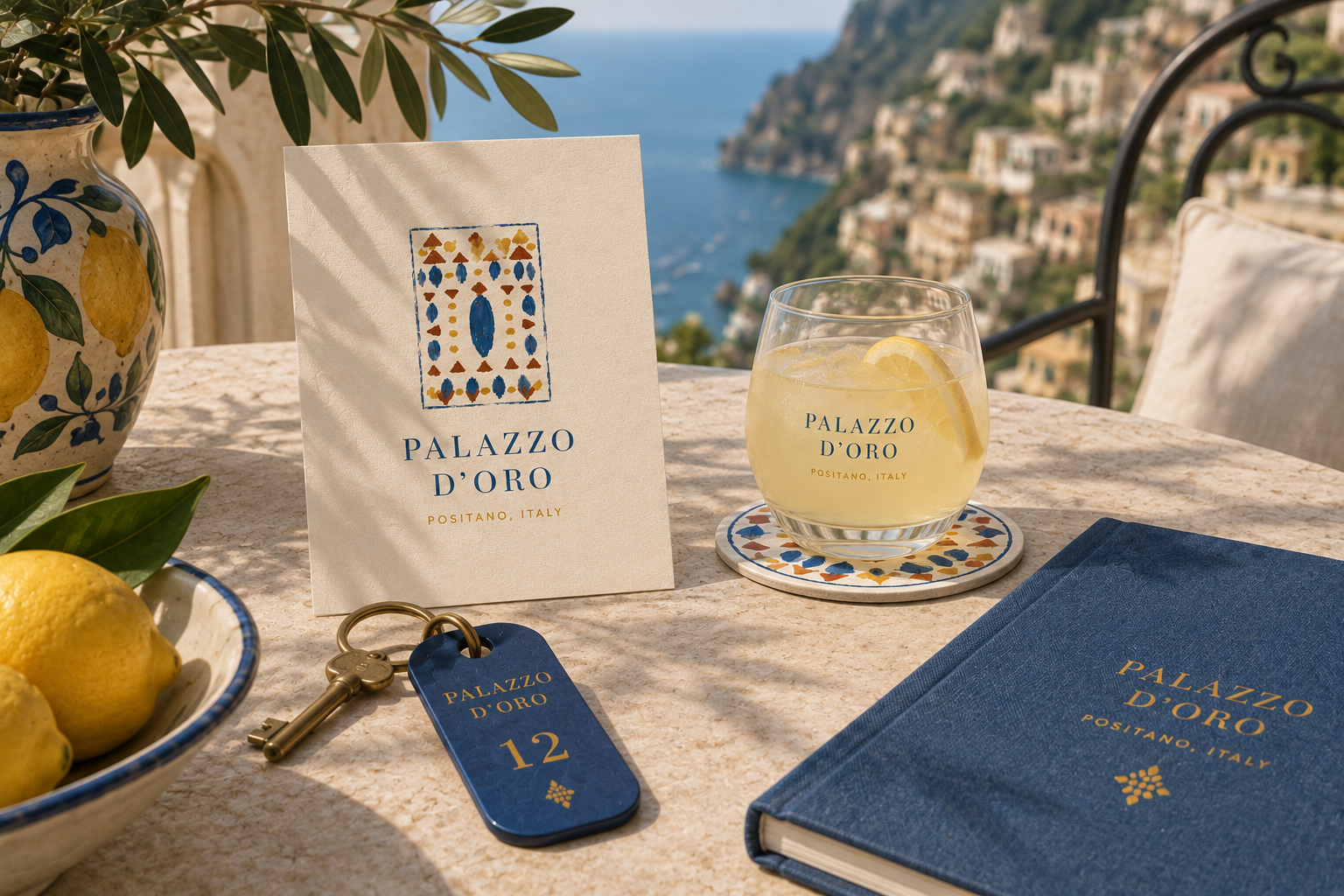
Palazzo D'Oro is a boutique hotel in Positano, on Italy's Amalfi Coast. The identity was built around one idea: arrival. The moment a guest first sees the coastline, the hand-glazed tile, the brass key in hand.
Behind that moment sits the craftsmanship that has quietly defined this stretch of coast for centuries. The brand's job was to belong to it.
The challenge
The Amalfi Coast has a postcard version, and everyone knows it: lemons, stripes, a very blue sea. It is the shorthand seen everywhere, and a boutique hotel with premium guests cannot afford to sound like everyone else.
The mark had to feel specific and considered, and a little bit discovered rather than designed. Something a guest would assume had always belonged to the building.
The mark's story
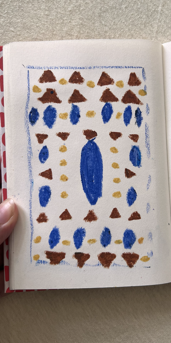
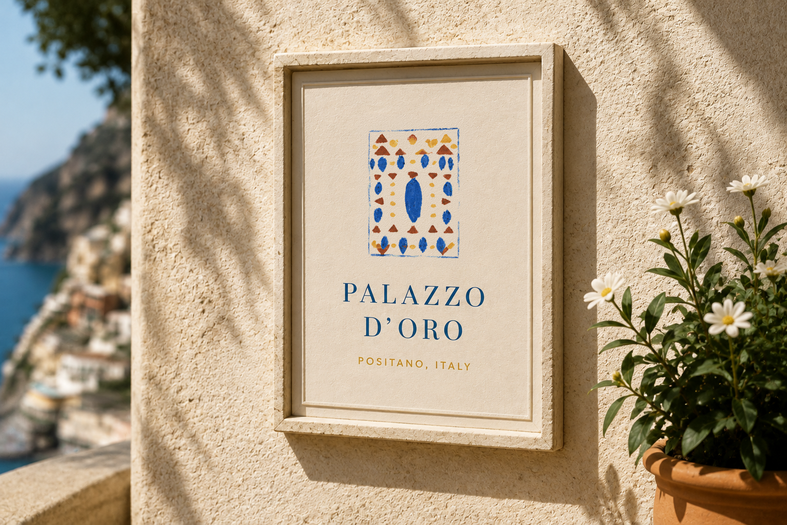
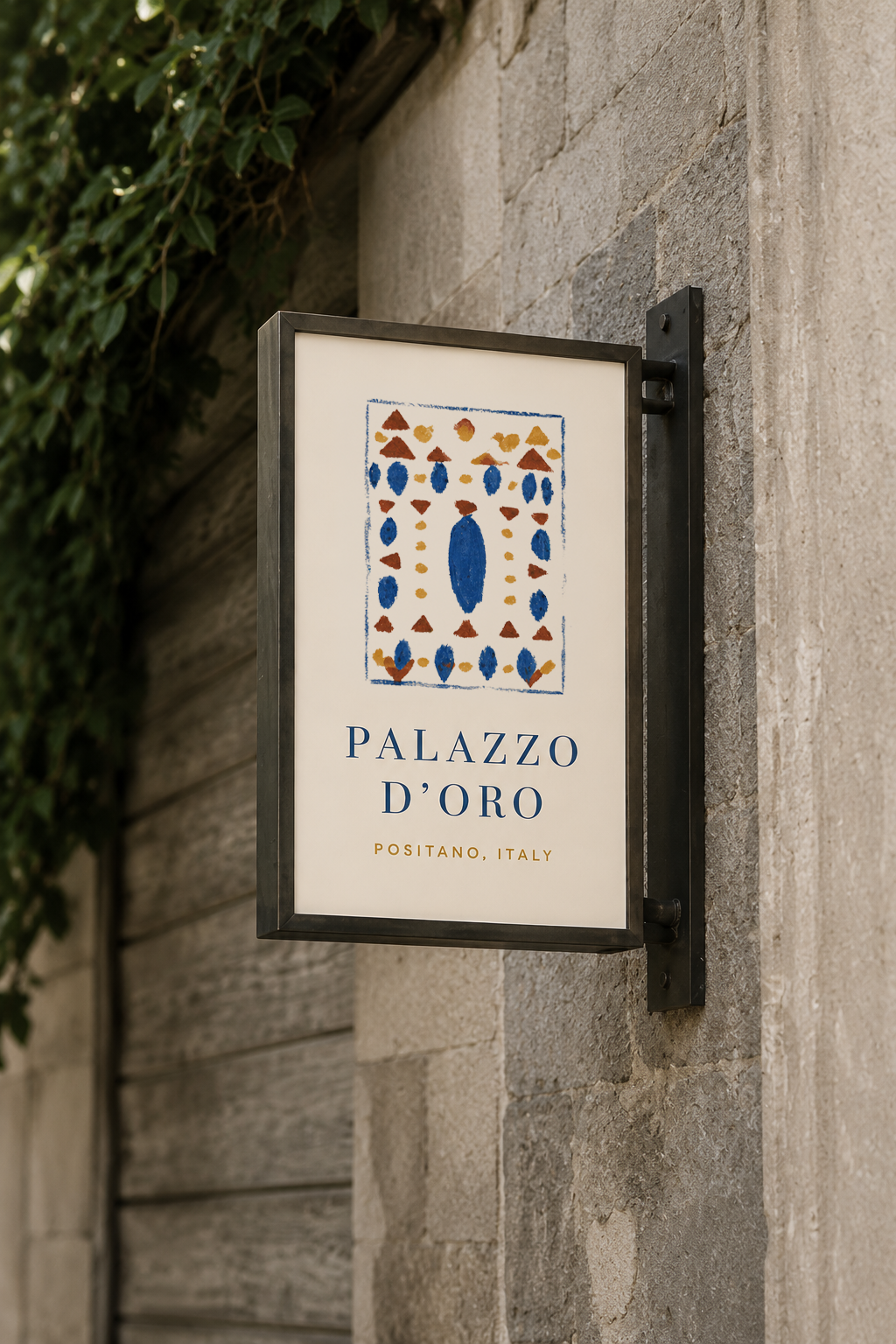
It began on paper, not on a screen. A hand-painted study of ovals, triangles and dots, laid out like a tile and framed by a loose blue line, the way a stamp frames its seal.
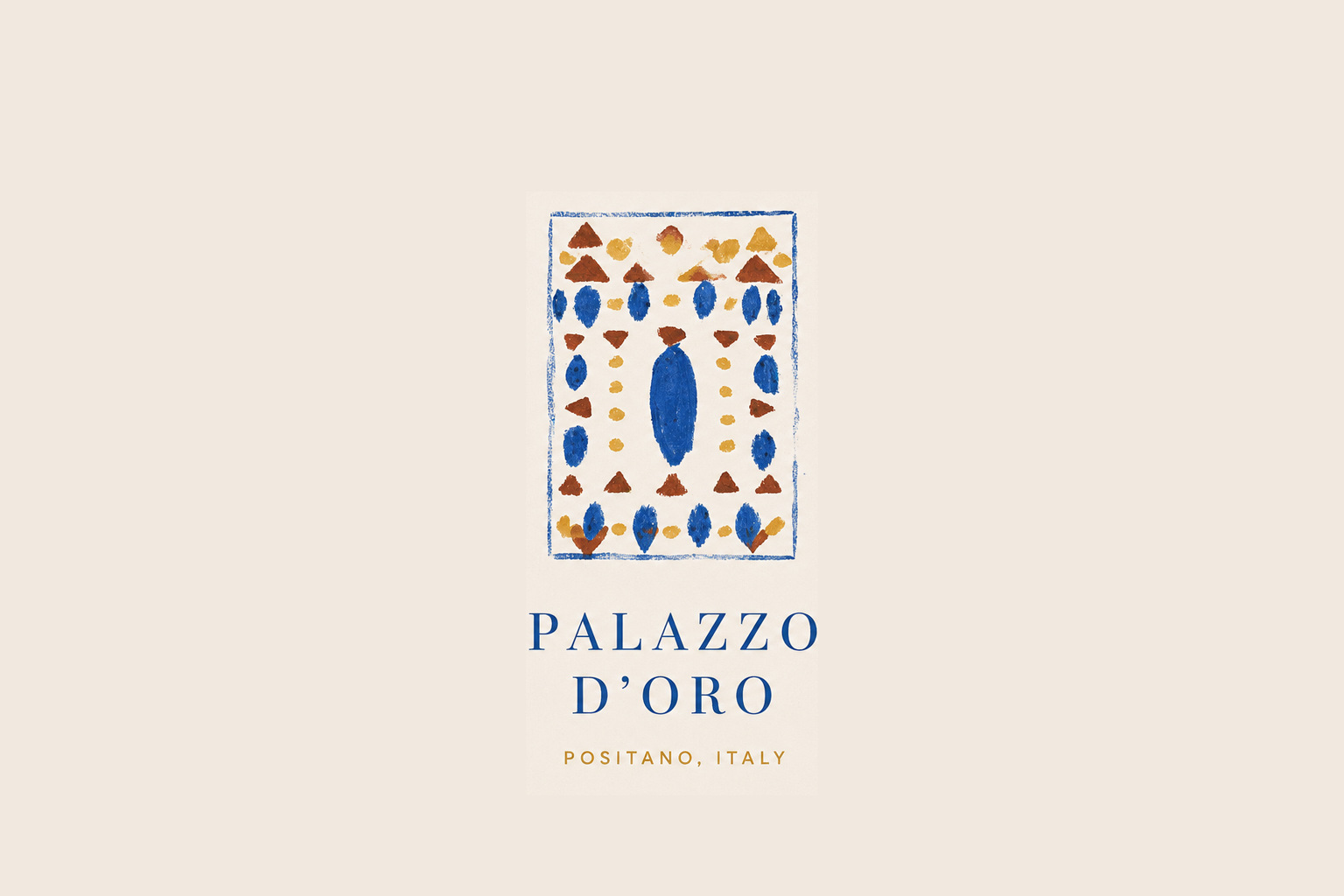
The uneven edges and visible brushwork are the point. This is a tile that looks made, not rendered. Paired with a refined serif wordmark and a small mustard line for Positano, it reads less like a logo and more like a mark of origin.
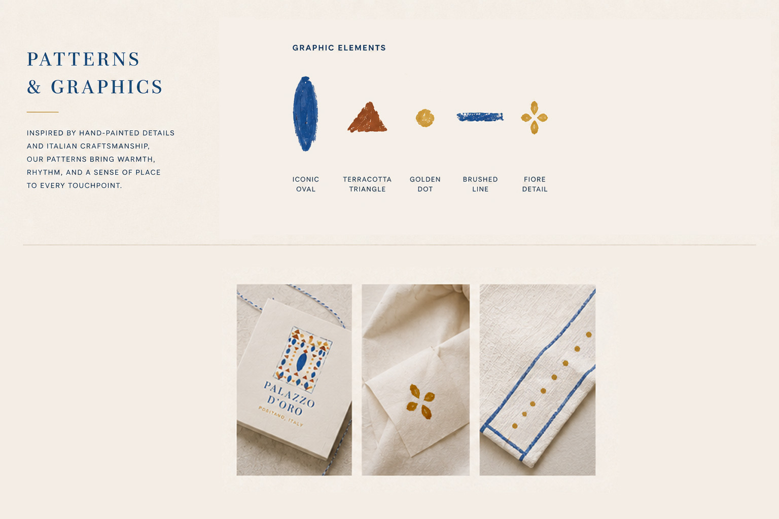
A system of hand-painted parts
The tile breaks down into a small vocabulary: the iconic oval, a terracotta triangle, a golden dot, a brushed line, and a four-petal fiore detail. Recombined, they become four patterns. Il Mosaico is the signature, with Mare, Terracotta and Sole as quieter secondary patterns.
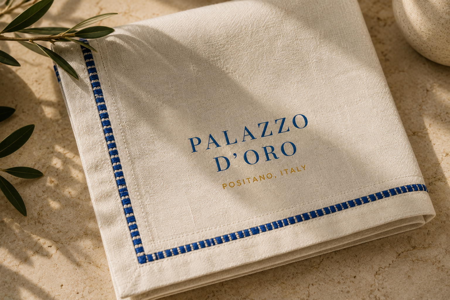
Frames and borders finish the edges: a hand-painted frame, a mosaic border, an oval border, a golden border. Applied with restraint across every touchpoint, from room keys to linen.
A palette from the coast
A warm and refined palette inspired by the Amalfi Coast, where rich earthy tones meet Mediterranean blue and soft stone. Terracotta carries clay and sunset walls. Cobalt is the depth of the sea. Mustard is sunlit and golden. Stone and ecru come from Positano's architecture, and ink handles text.
A flexible system
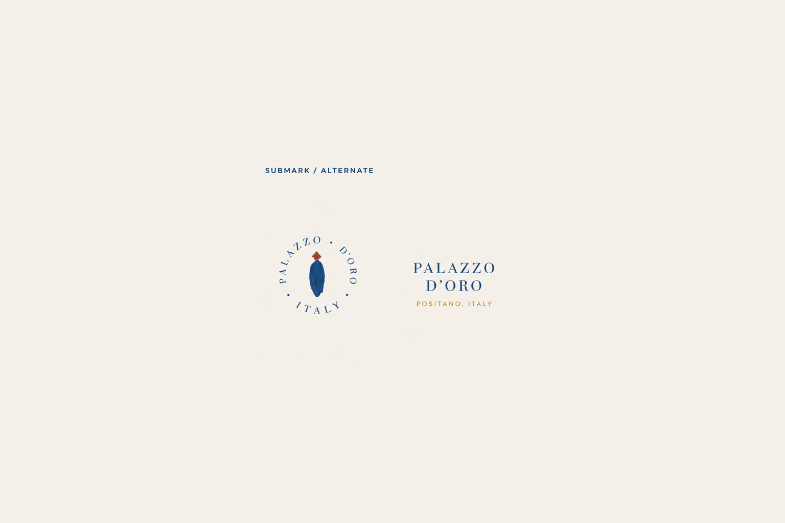
A circular stamp mark and a compact horizontal lockup extend the identity to spaces the primary mark cannot reach: wax seals, favicons, packaging bands, and small-format stationery.
The identity in the world
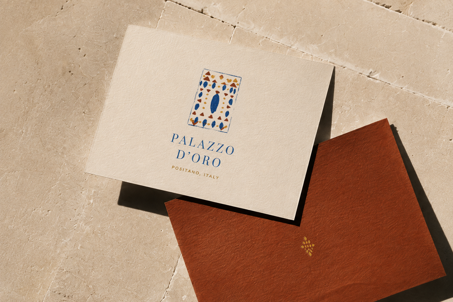
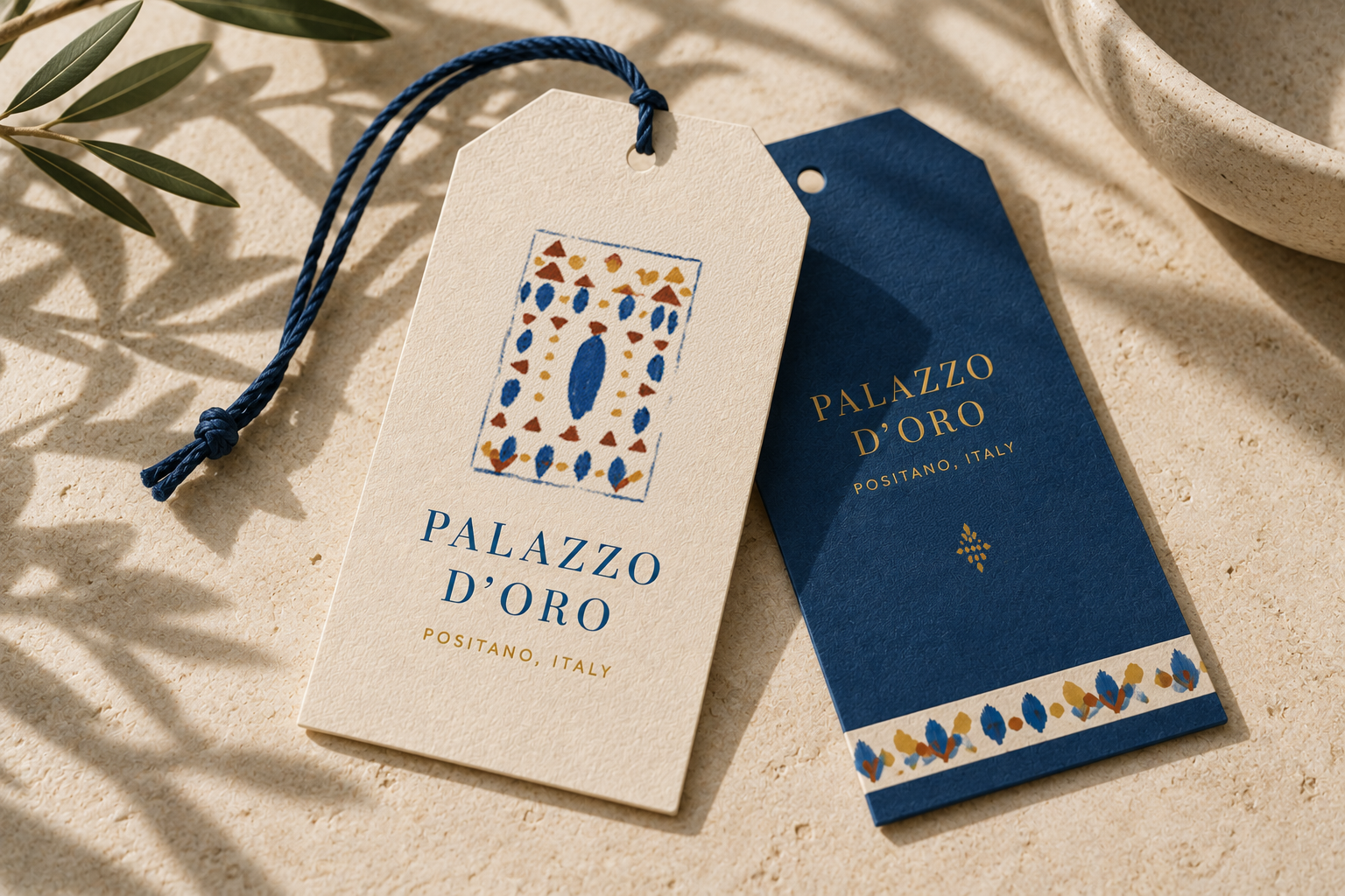
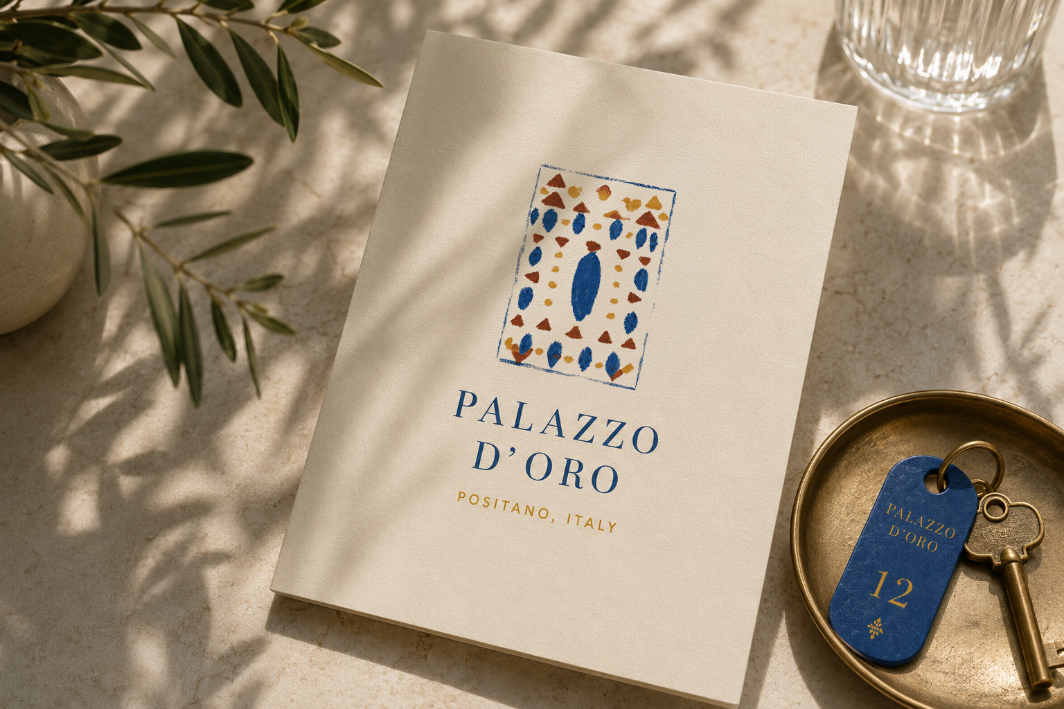
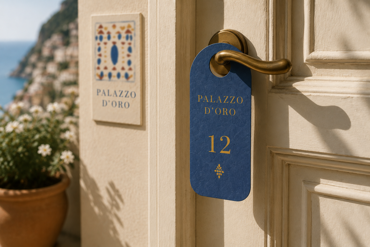
From the front door to the bedside table. Cards and tags in cream, terracotta and cobalt. Room keys and door hangers in deep blue with gold. Linen with a woven cobalt border. A stone-framed plaque and a projecting sign at the entrance.
Each piece draws on the same few parts in a different proportion, so the hotel stays consistent without ever looking stamped out.
Opening a place that should feel like it was always there?